Design Process
I led the design process from Aug. 2019 — Feb. 2021.
I was hired by Microsoft to help shepherd the product design through initial MVP development to a polished UX. I was responsible for creating the information architecture and core UX of the web portal — including hierarchy, navigation, interaction patterns, visual systems, and prototypes for product search and analytics tools. I also collaborated with two other designers to create Machine Learning and personalization tools.
-
Strategy
Determine goals, priorities, and success metrics
-
Research
Understand user needs, pain points, & market context
-
Define
Clarify design intent based upon goals and insights
-
Design
Explore concepts and turn them into testable solutions
-
Refine
Validate solutions and improve based upon findings
Setting priorities
When I joined the project, Bing for Commerce was a brand new product for Microsoft. The immediate design need was to generate MVP states for core features that were needed to onboard customers.
After discussing product goals and success metrics with the tech team, I began analyzing industry trends and conducting heuristic evaluations on competitor offerings to surface their strengths and weaknesses. I found that there weren't a lot of established competitors in the industry. This meant that the design process would need to be highly iterative to find the right approach.
I combined my learnings with pre-existing customer insights and best practices to create high-level design principles used to guide the design process toward our users' needs.

System Admins

Dev/Ops

Category specialists
-
Promote learning by doing.
Users for MBC tend to be highly skilled with expertise in one or more eCommerce domains. Due to their competence, they tend to move quickly into work, learning as they go. This means we need to support trial-and-error exploration by providing continuous feedback for actions in real-time and to embed in-context cues to accelerate learning.
-
Accomodate flexible and fluid workflows.
All three user types have broad, nonlinear workflows that require continuous data analysis to determine goals. Therefore, it's paramount to enable users to move back and forth seamlessly between analytics and customization tools without losing progress.
-
Reduce clutter without reducing capability.
Users want to complete their tasks as quickly and efficiently as possible. Providing too much functionality up front can clutter the interface and slow task completion. Therefore, feature overload should be avoided through tiered disclosure and supportive behaviors that show secondary functions only when relevant to the task.
Learn fast & iterate
I worked quickly to produce an MVP version of each feature. This process consisted of rapid iteration of low to mid-fidelity functional prototypes based on frequent discussion with the product team.
Low-fidelity prototype
Onboarding (New user)

Search customization (Returning user)

My first take for the product was focused on quickly capturing necessary functionality. My next goal is to make the experience simple and intuitive for the user, while still maintaining the full functionality.
I then collaborated with the product team to administer usability tests to over 20 participants to surface pain points.The tests asked participants to complete three core onboarding tasks with a minimum amount of instruction.
The findings showed that the early-state info architecture provided by the product team was meeting requirements for minimum viability from a functional standpoint, but still had far to go to support user's through the experience holistically. User frustration resulted from:
- messaging that was highly technical and confusing
- deeply nested navigation menus that impaired findability
- high value features that required multiple actions to access
- task flows that required complex operations were challenging for some to grasp
This was a great finding so early in the process because it helped to shift priorities for a highly technical product team and raise the bar for user experience.
Searching for an holistic IA
With a better understanding of specific goals and pain points, I was tasked with improving the IA and navigation. My intent was to make the flow effortless, reduce barriers to high value features, and make everything as clear and simple as possible through use of supportive language and wayfinding cues.
I began exploring classification schemes for the IA to determine how best to structure the content. An important part of this process is to plan how different customers will move through the application from an entry point to their final goal.
Hierarchical approach
The current version structured the content in a hierarchical manner. This made sense from a system perspective because the content had a concentrically nested structure, which requires a user to take action in order to move to the next level. However, this also meant that the most important features were several layers deep, obscuring their value.
For the sake of simplicity, I explored a variety of ways to maintain the current structure while presenting the content in a more accessible manner. The distinction I make here is that the presentation layer does not need to align to the backend if the UX is improved by the change and functional integrity is still maintained.
This approach provided some promising concepts, particularly for the primary task flow of the ‘returning user’ (typically a category specialist). However, I wasn’t able to resolve all of the challenges as elegantly as I hoped, particularly with the onboarding process.

A hierarchical scheme reflects the content structure; users move through a series of nested subgroups, with each providing more detailed controls. This version is similar to the previous—all features are available if permissioned, but task flows are separated; new users and returning users take different actions from a common entry point.

Users need to be able to move fluidly between tasks. This version has a single-level vertical navigation that affords movement between many high-level content sections (i.e. a hub and spoke model).
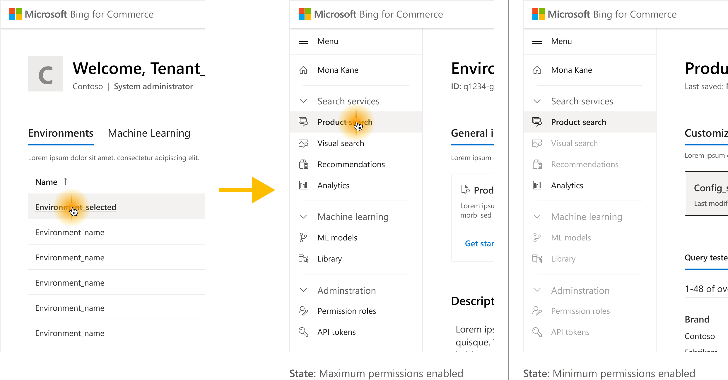
Hub and spoke menus are common for web app navigation, but the approach didn't hold up when degraded for users with fewer access permissions. A better approach is to provide only what a user can access so they don't feel restricted.
Task-based approach
Another promising approach was to structure the content around the most common user-task flows. The benefit of this approach is that it’s highly intuitive to the user when done well. The limitation is that it can only support a few task flows before it begins to get overly complicated.
In this case, it made sense to explore because there were only a few important task flows that needed to be considered, given that most of our users’ processes were nonlinear.

A task-based scheme organizes the content around the primary tasks users do. Here, related task flows are chained together; new users move through an onboarding flow to setup their system, while returning users move directly to using services.

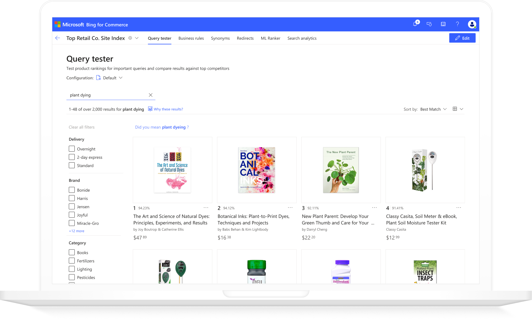
Search customization features are the primary value for our users so I explored ways to make them easier to access. This version positioned search services on the landing page so they can be accessed with a single click.

Putting search services on the landing page made them easier to access, but this created trade-offs for environment access that weren't acceptable for all user types. While not adopted, the exploration helped inform a better approach.
v.1 Release
A mixed approach
After iteration we had several viable approaches, so we A/B tested the most promising concepts with industry partners and experts within our organization to surface feedback.
This led to a mixed approach that combined the best aspects of each–an intuitive flow that aligned to our users’ most prominent tasks and a structure that maintained the content hierarchy.
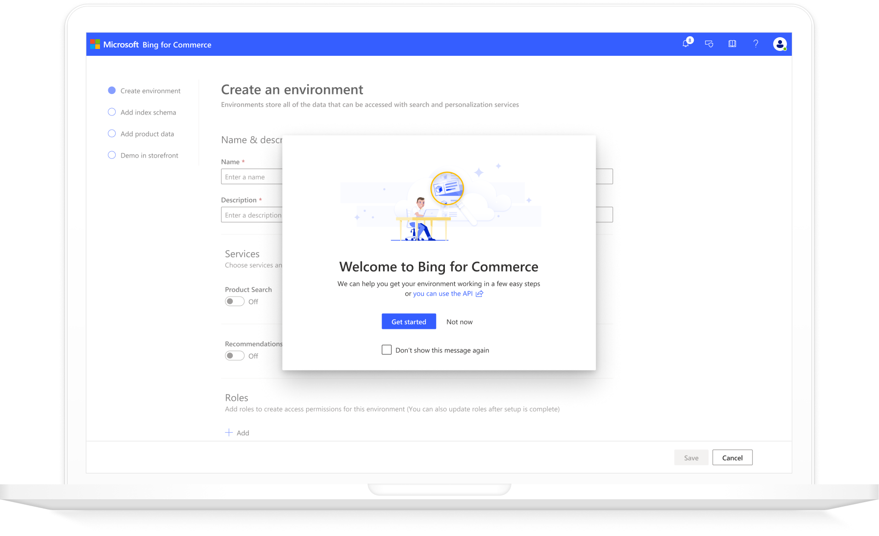
The task-based approach worked particularly well for the user onboarding, resulting in a wizard-style process that guides the user through each task while allowing them the flexibility to move forward and back at their own pace. The value of this approach is that it not only directs users through the process effortlessly, but that it also teaches users important terms and concepts along the way.
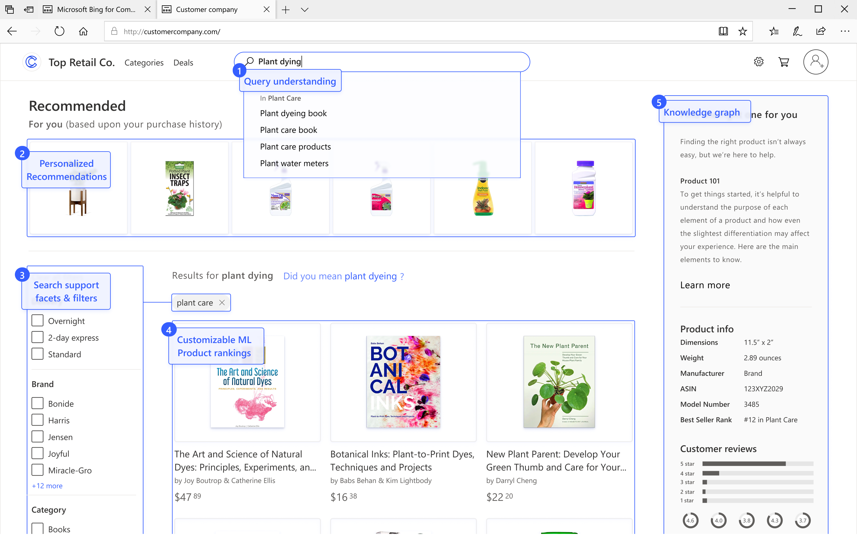
The process culminates in a personalized storefront for the user to use as a test environment before publishing their products on their own consumer website.
v.1 release
Onboarding (New user)
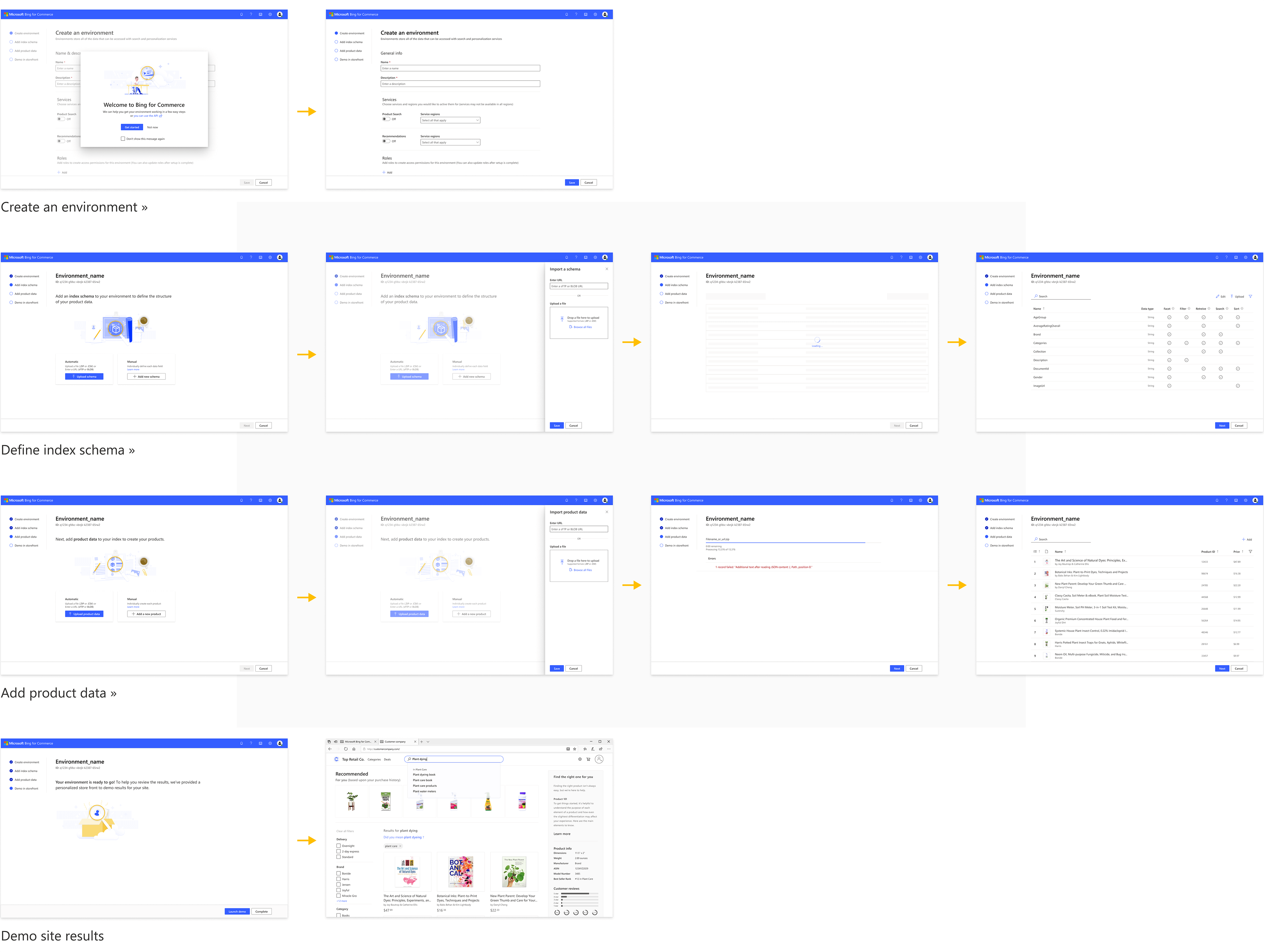
A mixed approach was adopted for the initial release. The task-based approach worked well for onboarding since it's a linear process requiring multiple steps to complete.
Search customization (Returning user)

The hierarchical approach worked better for the primary use task flow since it is nonlinear and fluid. This version featured an independent level for the environment settings, which I later removed from the core flow.
Design system and accessibility
As preparation our MVP release, I created a design system for the product based upon Fluent Web. This process included developing a color system to give the app a unique look and feel within the brand ecosystem, as well as aligning interaction patterns to successful Microsoft apps to maintain alignment with brand identity.
This included optimization for WCAG/ADA 508 compliance and best practices for color contrast ratios, color blindness differentiation, and keyboard control patterns.
Color contrast

Color blindness

Keyboard controls
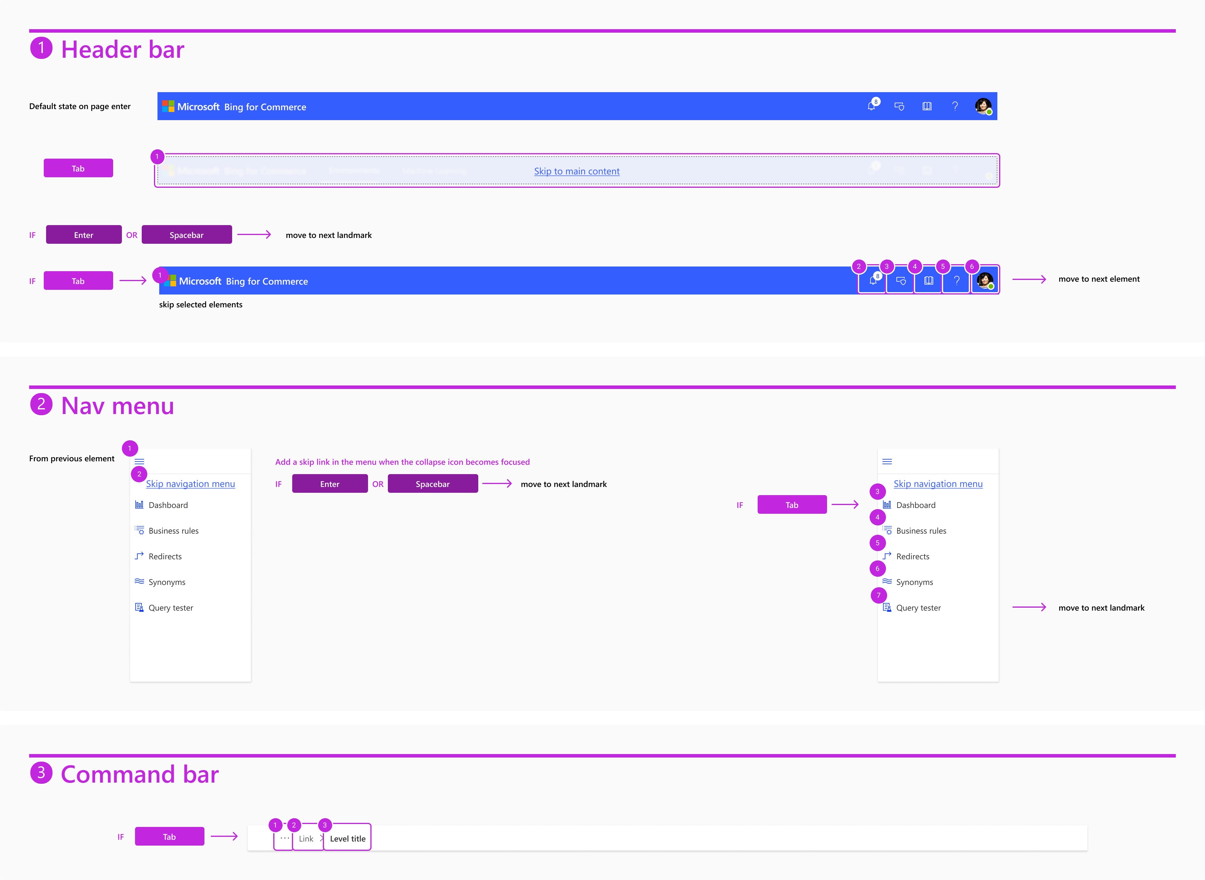
High-level navigation controls include 'skip links' so users can easily bypass large groups of controls to move through the page more easily. Detailed control patterns were also applied to each mockup to optimize the flow of its layout.
v.2 Update
Refactor, refine, & scale
With the initial design process concluded, I was able to begin refining the UI into a polished state. After rapid iteration process, it was important to re-prioritize important features and simplify the UI to avoid feature accretion. By reducing features that imparted only limited or occasional value I was able to create focus for important information and high value actions, while minimizing cognitive demand on the user.
Looking at the product in this way also led to new insights for the IA. I realized that the seperation of service features was done primarily to align to their seperation on the backend. Removing this distinction was more challenging in thought than in implementation and created more fluid pathways for user workflows.
As a result, I created a streamlined navigation design that allows users to move between all service features fluidly. To further this value, I was able to create a seamless experience in which users can access high-value service features with a single click from the landing page. A huge win for the UX!
I made sure users could move fluidly between the core features for rule-setting and the analytics tools they need for assessment and decision-making.
Results
The product was launched in January 2021. At last report it was serving over 50 million search queries per day... and growing!
I am proud of what the team was able to accomplish on the project, especially given the challenging time constraints. The result underscores the importance of considering the unique circumstances of each project and seeking an optimal balance between user needs, content requirements, and business value.
The challenge of creating quality IA is that of balancing the high-level structure with low-level flexibility. I achieved this balance here by mixing hierarchical structure with task-based convenience. This meets the goal of providing clear and simple direction in the onboarding phase while also accommodating fluid workflows for customization.
I completed the design work on the product in February 2021, and have since moved on. The team is currently focused on implementing the design work and growing the customer base.
