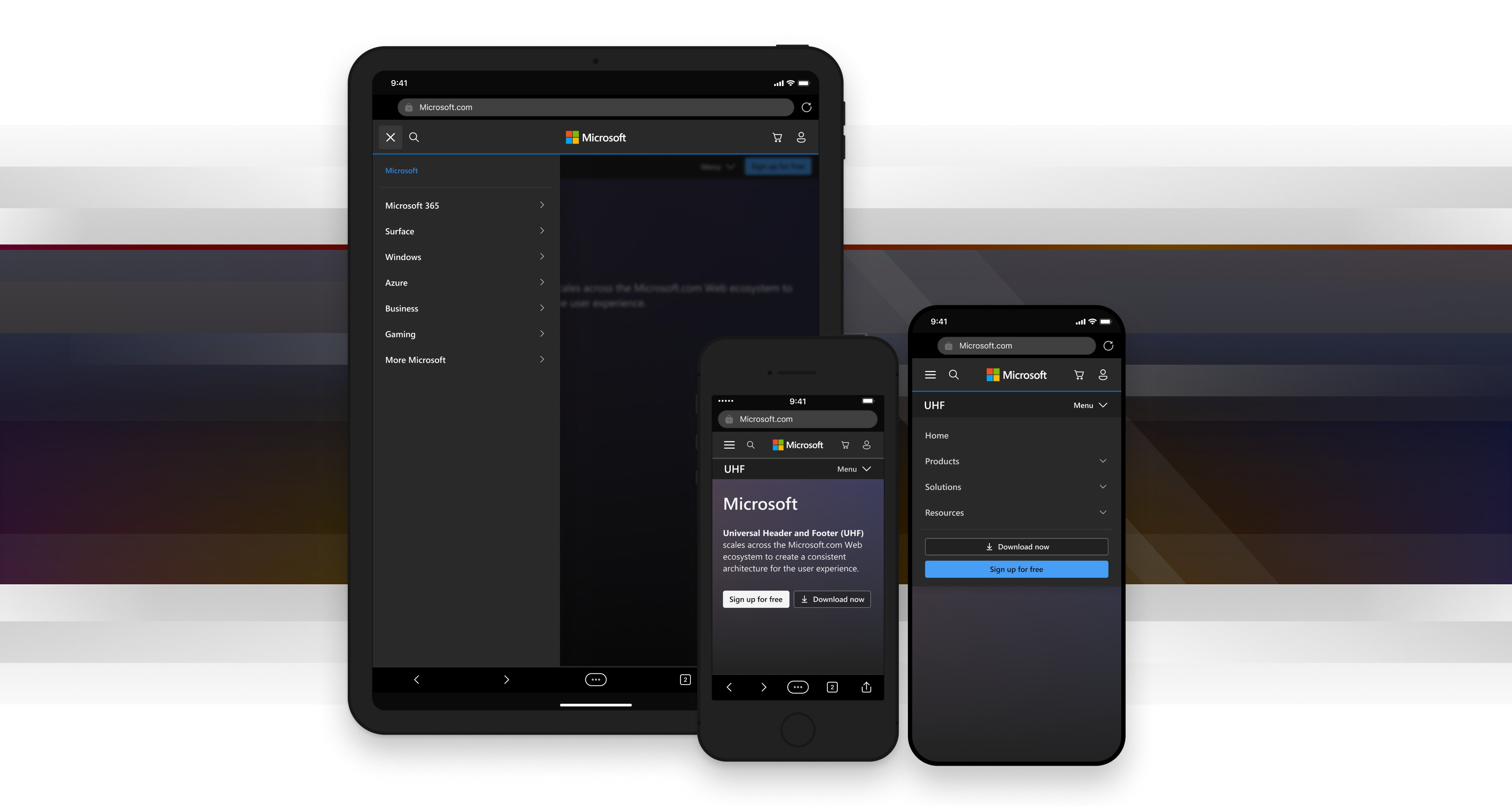
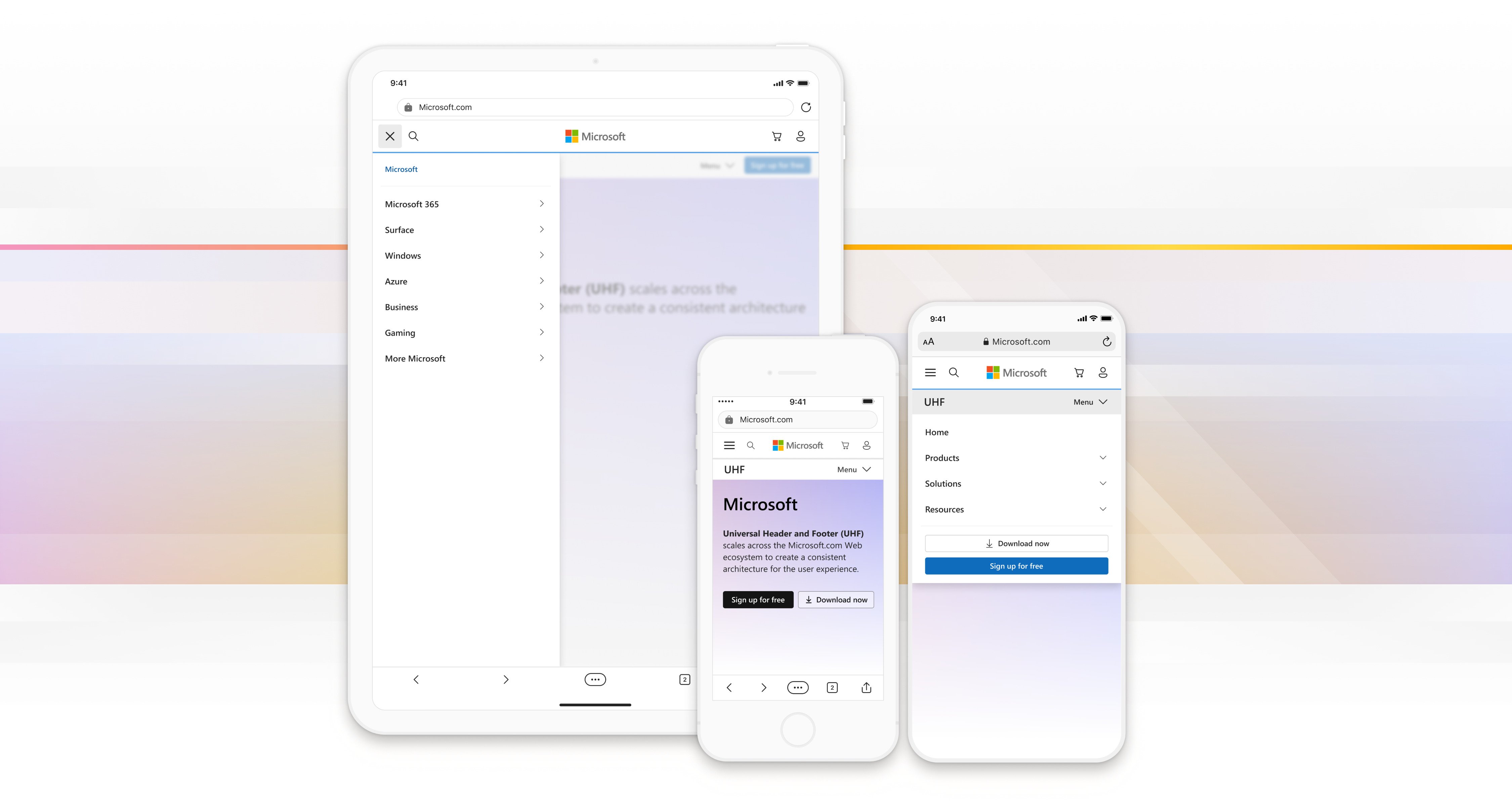
Universal Header & Footer
With a shift to a new design system, a new approach toward eCommerce, and a major move toward AI happening in 2023—Microsoft needed to update the navigation for its collective web experience to maintain alignment with its future direction.
I created this prototype to show how the universal navigation we created allows customers to move easily across Microsoft.com sites, while the contextual navigation provides movement deeper into a site's content. I reinforced the structure with directional cues in the menu’s behavior.
Re-designing Microsoft’s Universal Header and Footer (UHF) is a big challenge because it scales across the entire Microsoft.com Web ecosystem.
This ecosystem consists of several thousand sites that span across many independently operating business groups in the company. Each of these business groups (Surface, Azure, Xbox, etc.) have their own differing use cases, business priorities, and technical requirements for their sites.
The current navigation relies solely on contextual menus that are different for each business group. Over the years, their needs have moved further apart causing the navigation to become inconsistent—divided by the org structure and with no common brand narrative. The resulting lack of consistency across their sites makes for a confusing user experience with no clear mental map for customers to navigate by.
Our goal was to create a clear hierarchy and navigational structure to help users understand and mentally map the site ecosystem.
We needed to realign the navigation experienced across Microsoft sites while providing the flexibility to ensure the unique identity and continued success of business groups within the new structure. Most importantly, we needed to make it easy for customers to get around and find what they want when they want it.
I analyzed competitor offerings to surface design patterns and then used the most robust patterns to build prototypes for validation with users.
- I analyzed system analytics and competitor offerings to surface best practices and clarify a design direction.
- I created a simple and consistent structure for the mobile experience to emphasize the essential value of the navigation and support user needs.
- I reinforced the site architecture with subtle directional cues in the menu’s behavior.
- I worked out focus order and responsive reflow patterns to make the navigation accessible and scalable.
- The design has gained widespread adoption across Microsoft business groups and is nearing release.
To improve the user experience we first needed to understand the current and future organizational structure, how the current navigation affected the success of each business group, and what navigational patterns would be most appropriate for creating a consistent, scalable, and yet flexible system.
We had a lot of analytics from the current system, but not a lot of actionable information. I helped to solve this puzzle by analyzing our data and creating a series of data visualizations to clarify important usage trends in the current system. After all, a negative financial impact for any of our business groups would be a non-starter for our design.
I then did a comprehensive analysis of design patterns used on competitor websites. I broke these down into four categories that in sum represent Microsoft’s business priorities: global tech companies, global eCommerce companies, most profitable retail companies, and highest volume computer retailers. Within each site, I captured information about the site structure and navigation patterns, including images, interaction, and behavioral details. This provided our team with direction and we were able to begin exploring these patterns to find the best approach for Microsoft.
Before
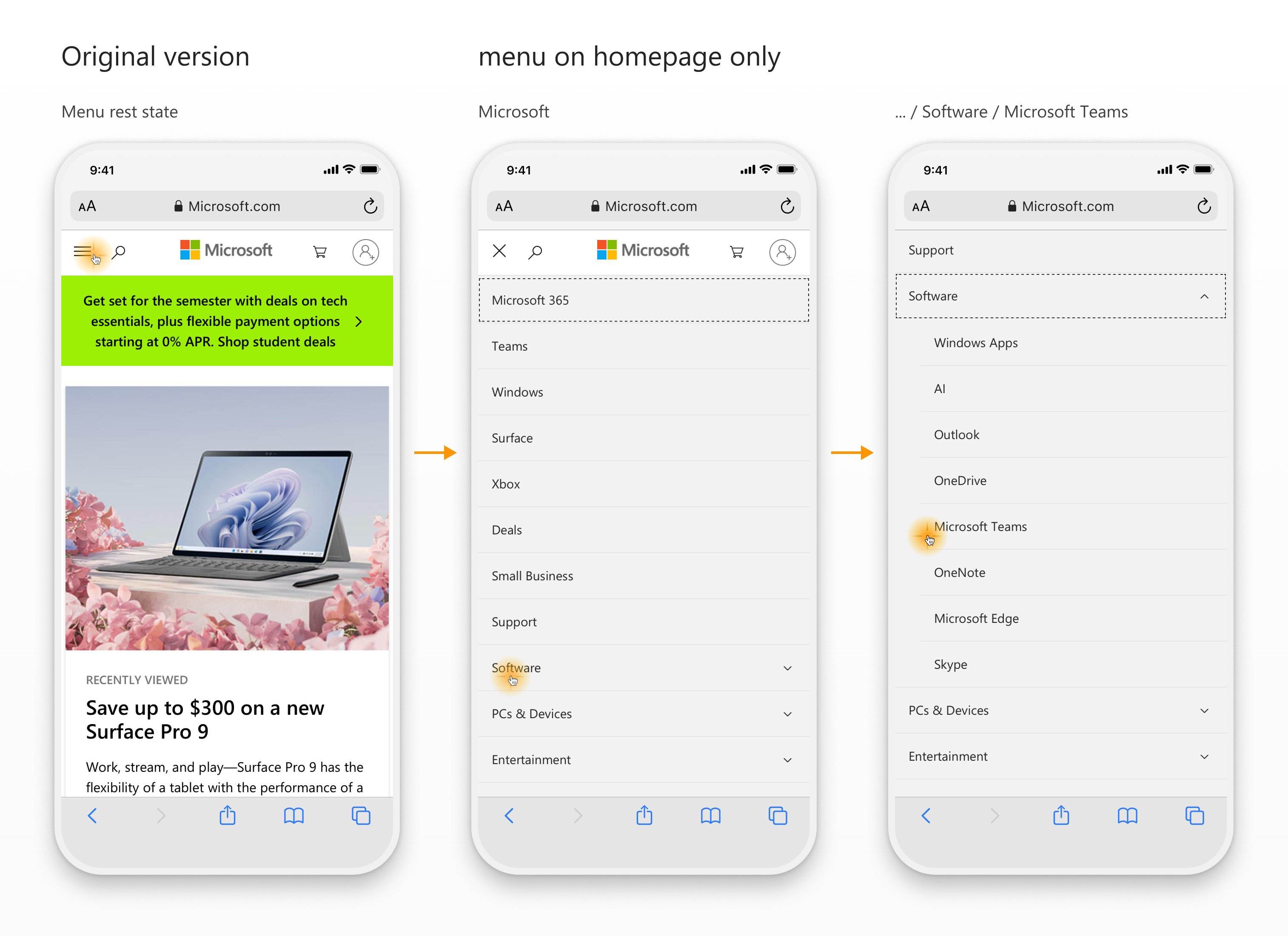
Microsoft's current navigation only provides top level options from the Microsoft.com homepage. (above) The updated version provides top level navigation options from every page of every site for a more cohesive experience. (below)
After
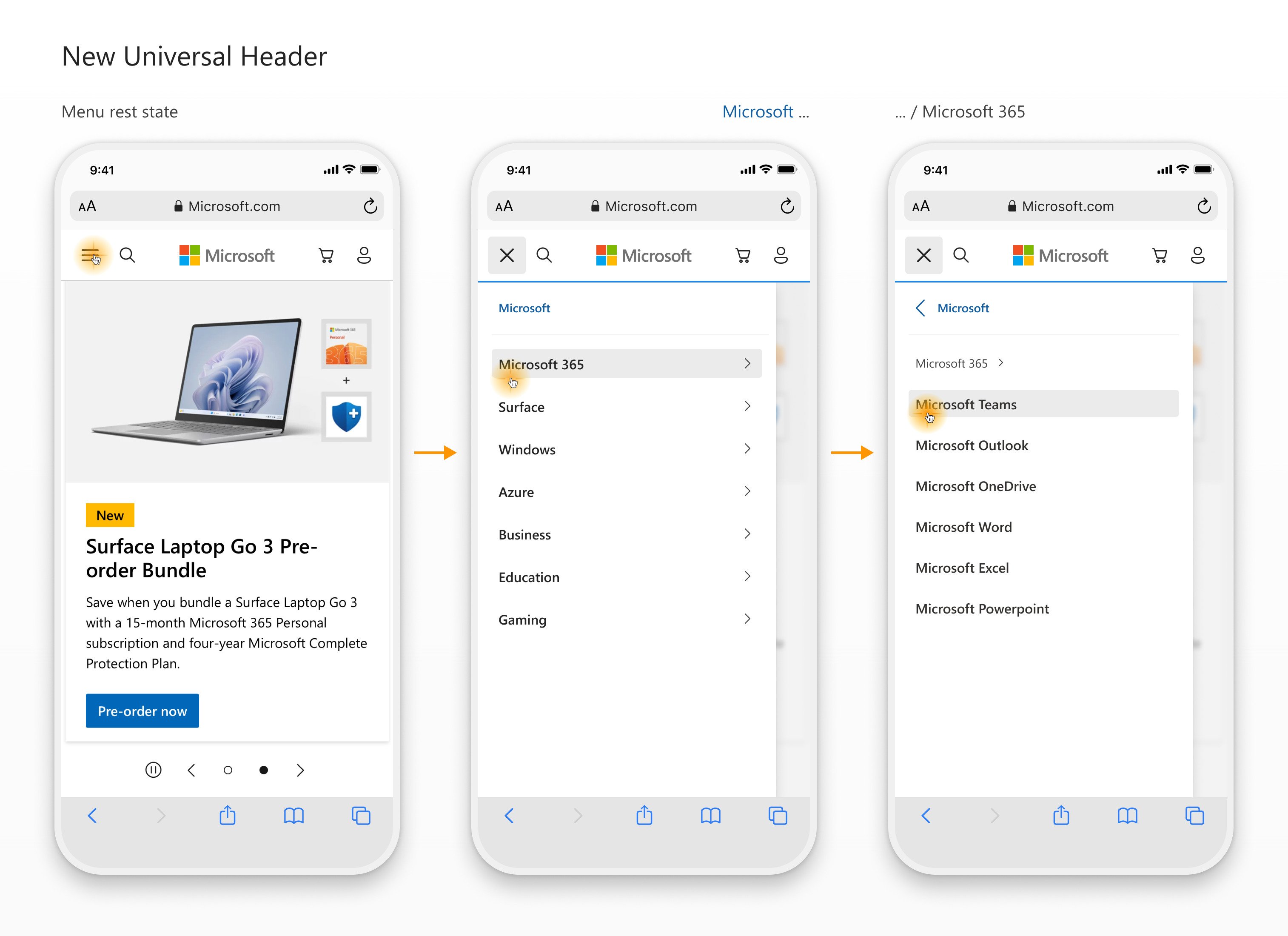
The universal navigation slides in from the right and moves horizontally over the top of the page content to reinforce both its place at the top of the hierarchy and that it affords broad lateral movement across the top pages of the site.
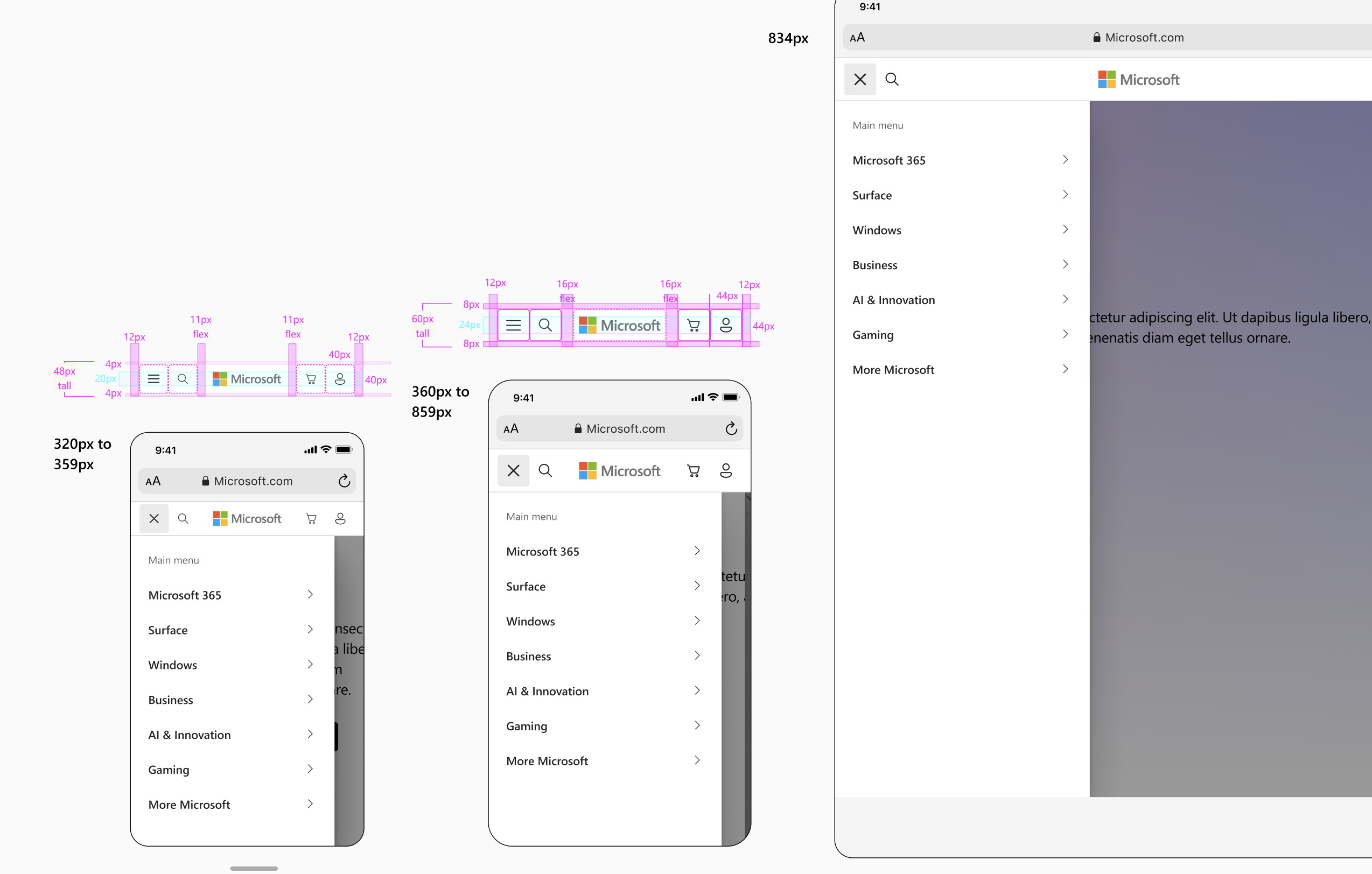
It's important that Web navigation aligns with and supports user goals and mental models. This promotes customer satisfaction and engagement. However, creating user-friendly navigation on mobile devices poses a challenge because of the constraints of small screens and the necessity to prioritize content over UI elements (ie content vs chrome).
I crafted an easy-to-scan visual hierarchy to emphasize the essential value of the navigation — to orient users to where they are and where they can go to find information they need.
I minimized visually persistent navigation elements to maximize screen space for content and focused on easing navigation tasks by making them easily envokable through consistent visual and behavioral patterns in the UI so users can leverage their previous experience to maintain orientation to their task.
A few heuristics for modeling navigation:
- Clear landmarks/labeling
- An indicator of where you are
- A clear means to advance
- A clear indicator of what you can do (i.e. what's actionable)
- A consistent way back (to home)
- A consistent way to search or cancel
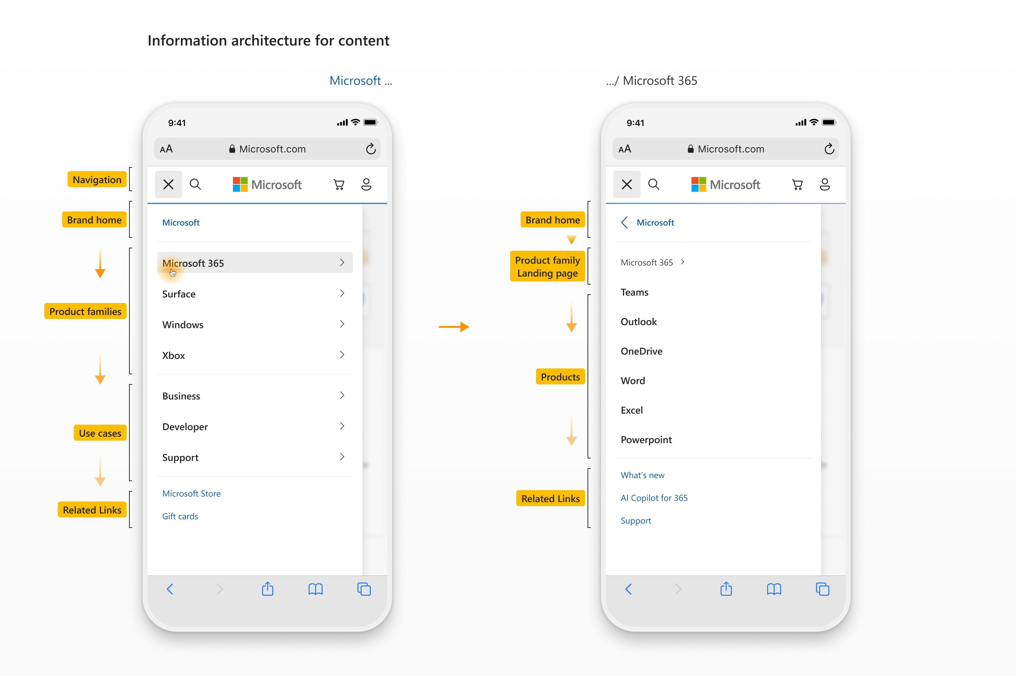
Brand home allows users to easily get to the Microsoft homepage from anywhere in the network. It also sets a tone of authority and cohesiveness for the brand. Related links provide convenience for accessing commonly sought content, like shopping links.
Even though the exact content is not yet final, the content structure's that are created are critically important because they determine the content that can later be provided.
A beneficial approach for menu design is to create multiple navigational pathways for seeking content that reflect both a product-oriented approach based on brand recognition and a more task-oriented approach based on user goals or use cases.
A few considerations for content IA:
- Consider the product and information finding needs of different types of users based on their information-seeking approaches (e.g. browsing, searching, wayfinding, refinding).
- Prioritize the top and bottom elements because they tend to be focus points for users.
- Include at least two category paths in a polyhierarchy approach to support common user mental models. This means some prioritiy links may be duplicated to highlight them in different categories (like Microsoft 365 and Business) to allow users to choose how they want to browse content — in this case product families and use cases allow users to browse based on a known product or based on an open-ended job-specific goal.
- Lastly, continue to lean into visual branding elements to make the menu look distinctively Microsoft.
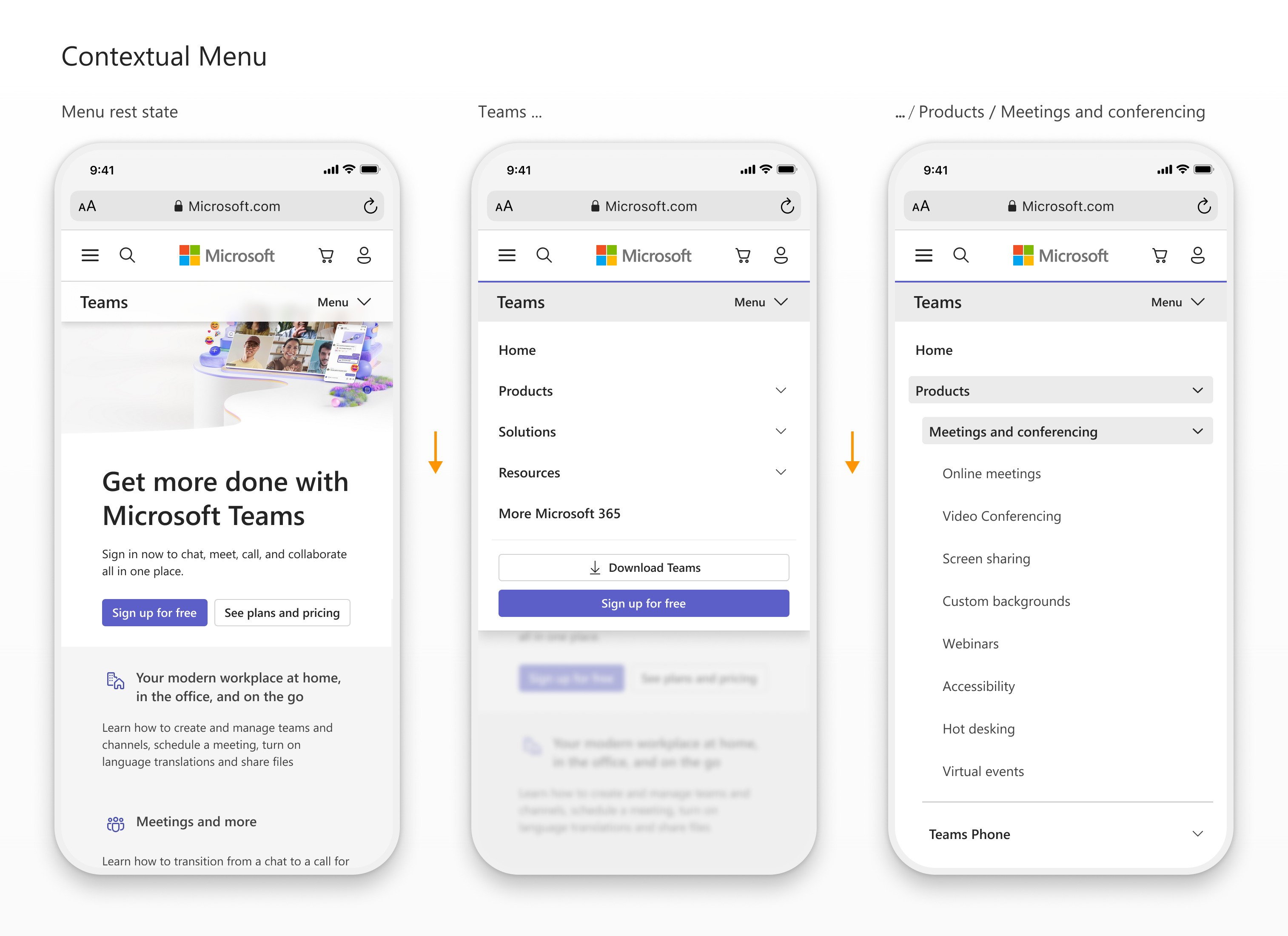
The contextual menu moves vertically to emphasize that customers are moving deeper into the site’s low-level subcategory content.
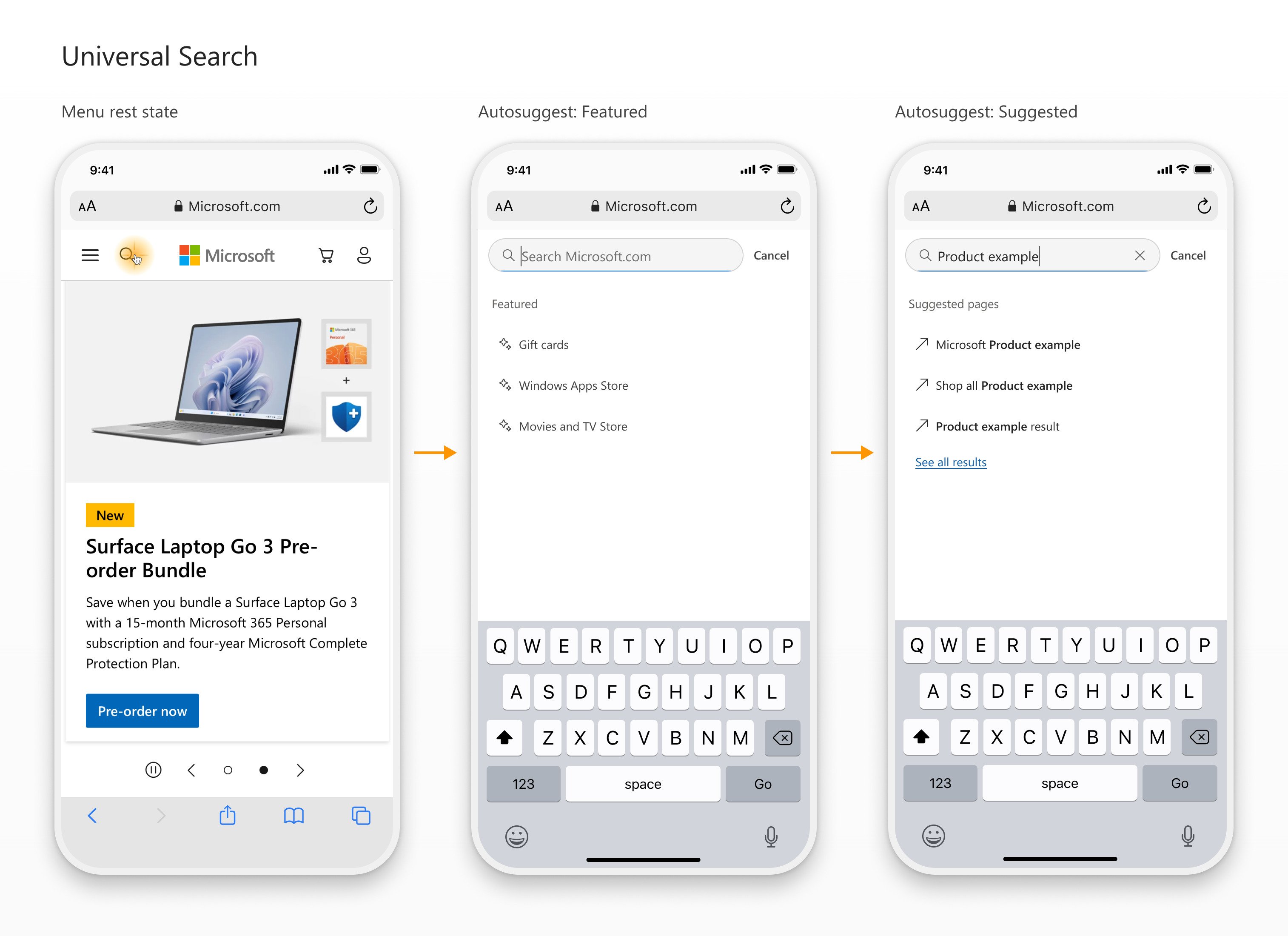
Utilizing a dissolve transition emphasizes that Search is non-directional and ensures that users can go to and from Search through a smooth visual transition regardless of on-screen content.
I surfaced the most well-established patterns for Search and we aligned on a direction based on our user research and needs within the organization. I made Search full-screen on mobile to remove distractions and ensure that users can focus their complete attention on finding what they need.
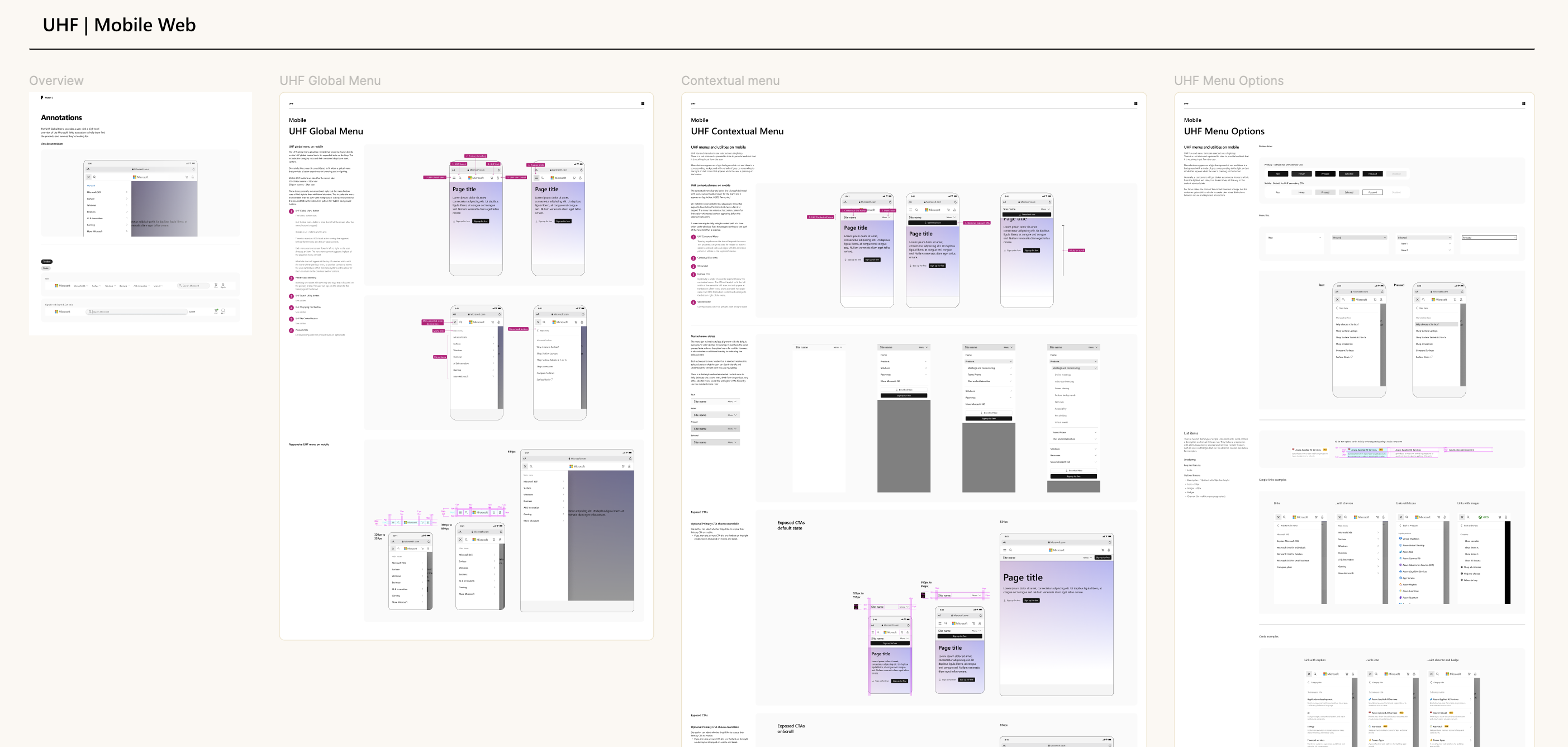
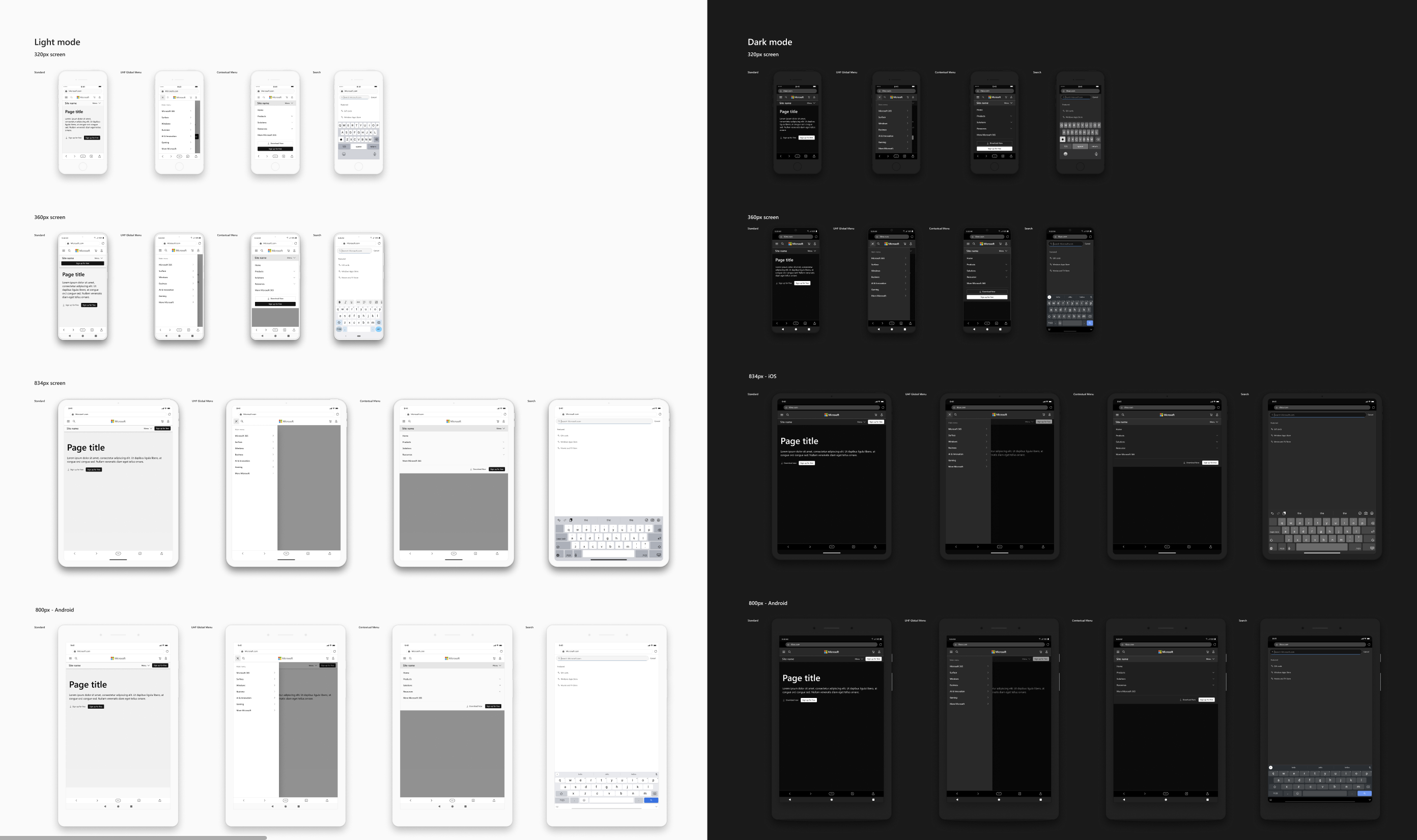
Lastly, I collaborated with a teammate to make the navigation consistent, accessible, and scalable across mobile and desktop.
This included working out keyboard shortcuts and focus order, an inventive skip menu to improve ease of use for keyboard users on desktop, and responsive reflow patterns. To finish the process, I created flexible and easy to scale components through progressive enhancement and aligned the new navigation to the cart and checkout in the purchase process—as they are unique moments in the Web experience that require reduced navigation.
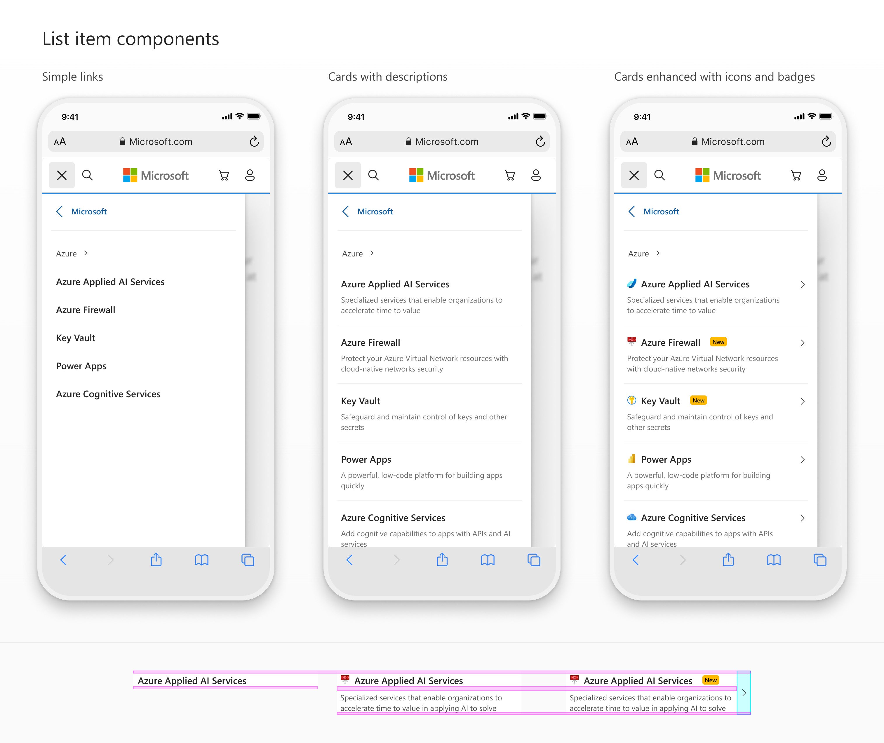
I designed a scalable list item component so that it can provide every required options by simply enhancing or degrading this single component.
In the end, we simplified the experience by creating a multi-layered navigation system that establishes a clear and consistent mental model for the user experience.
I created a robust design system for navigation patterns with detailed prototypes, components and annotations.
A universal navigation at the top of each page streamlines access across the vast network of Microsoft.com sites. This is complemented by a contextual menu within each site, designed to be user-friendly and customizable to meet the unique needs of each business group. We unified the brand and reduced effort for customers by simplifying menus and creating an intuitive look and feel across the Web ecosystem.
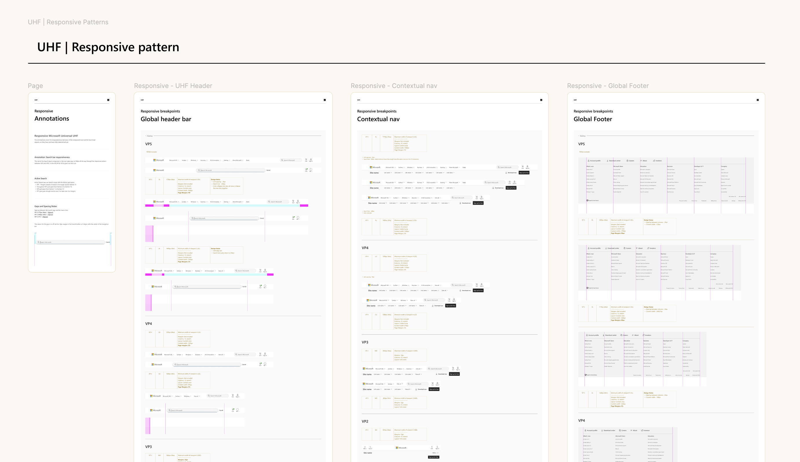
I produced a detailed spec for scaling navigation with responsive patterns to maintain the best experience across platforms.
Research indicated a positive response and reduced effort for the majority of users. Additionally, there are encouraging signs of revenue growth for several business groups, although further research is needed to understand the longterm impacts.
There’s great optimism and excitement across the organization to finally have a sleek and modern navigation for the Web experience. The design has gained widespread adoption and is currently in development for an upcoming release.